From big names like GWAR and Lamb of God, to current indie stars Lucy Dacus and Natalie Prass, Richmond has been home to incredible musicians for a long, long time. Richmond bands and artists have holed up in studios like the Ward and the Virginia Moonwalker, as well as countless bedrooms in the Fan and Oregon Hill, to produce some of my favorite records of all time.
(Do you see where this is going?) Each of those records is accompanied by album artwork, often created by local artists. In this edition of the Richmond Design Roundup, I’m going to highlight a few of my personal favorites. Note: it would be absurd for me to try to cover the whole history of great Richmond album covers so I’m only going to highlight a few records that have been released since I moved to Richmond (in 2009).
Here we go. 🤘
Houdan the Mystic & Fight Cloud - Where’s My Shakespeare? (Victoria Borges, 2014)
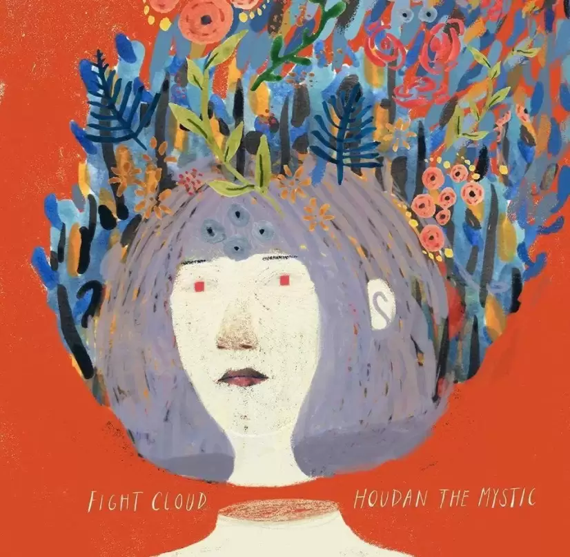
Richmond illustrator Victoria Borges is a creative powerhouse. As the artist behind 5 Good Day RVA festival posters as well as two album covers for Richmond’s Houdan the Mystic, the VCU Communication Arts & Design alumni has made her (literal) mark on the Richmond music scene. Her work for the 2014 split between Houdan the Mystic and Fight Cloud, Where’s My Shakespeare?, is one of my all time favorite album covers. The forest of color soaring from the character’s head perfectly echos the intricate guitar work on both sides of the split. The blend of warm and cool tones in the palette are eye catching without being overwhelming, similar to the music—complex, without being showy or inaccessible.
Postive No - Partners in the Wild (Kenneth Close, 2017)
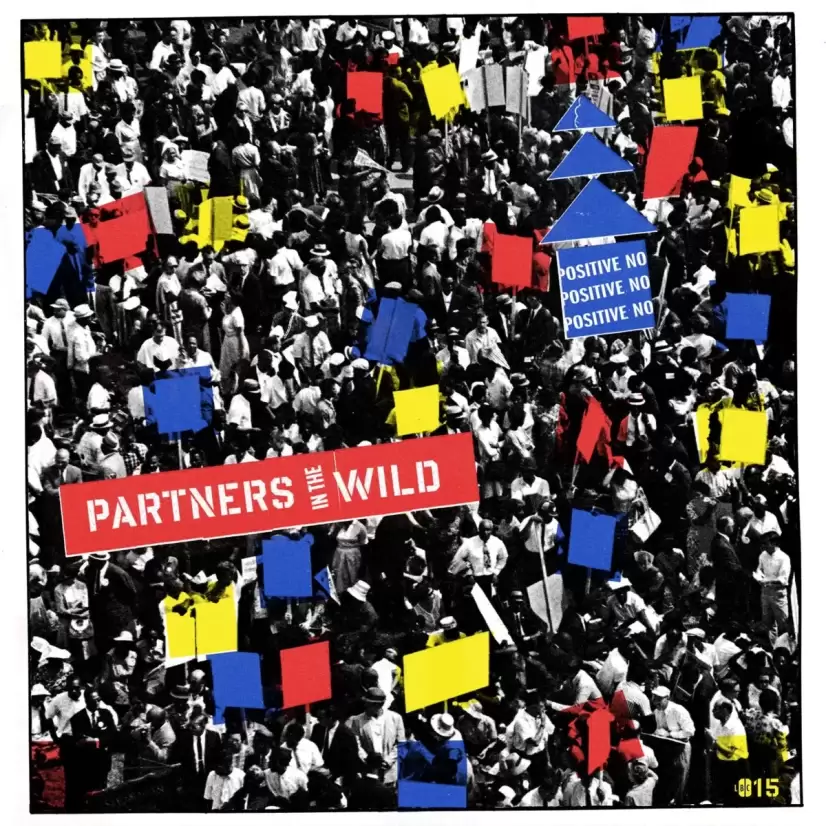
Positive No are an infectious energy. The band’s overall aesthetic is loud and bright; Pop Art influences are apparent in their discography’s visual lineage, as well as frontperson Tracy Wilson’s killer wardrobe. The noise pop band’s latest LP, Partners in the Wild, released in October of last year on Little Black Cloud Records, features another example of this ongoing and intentional aesthetic. Guitarist Kenneth Close created the album artwork using an archival image and pops of primary colors. The stencil-esque typography is reminiscent of graffiti, or protest signage, a nod to the band’s commitment to using their music as an outlet for positive change.
Dorthia Cottrell - S/T (Rachel Freeman, 2015)
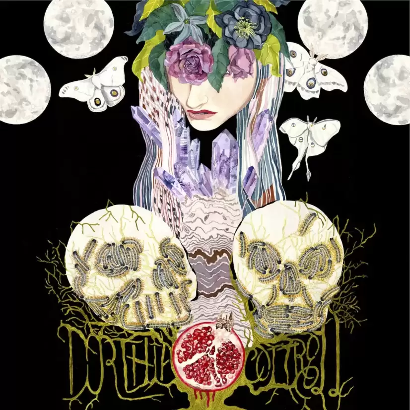
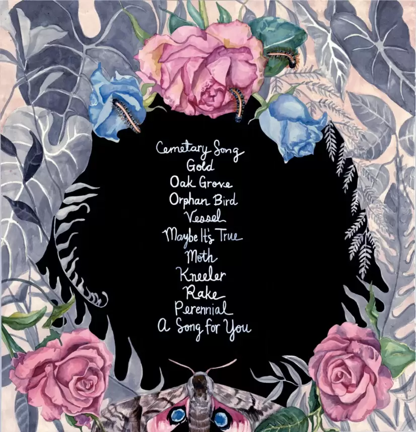
My knowledge of Dorthia Cottrell, like most, comes from Windhand, the Richmond based doom metal band Cottrell fronts as lyricist and singer. In between touring and performing with Windhand, Cottrell wrote and recorded one of my favorite albums of 2015. Her debut self-titled record (Forcefield, 2015) is a haunting piece of dark folk, inspired by Windhand and their peers, as well as grizzled folk legends like Tom Waits and Townes Van Zandt, the latter of which Cottrell covers on the record. The album artwork, by Rachel Freeman, perfectly captures the blend of genres and influences apparent on the record. At first glance, the letters spelling out Cottrell’s name might look like another generic black metal font. Upon further inspection, however, they emerge as root like structures, weaving through the skulls above the name. The typical dark imagery is swapped out for more beautiful, natural themes; luna moths, a pomegranate, and crystals. On the back, the track listing is framed by a beautiful arrangement of flowers, with another moth centered at the bottom.
Opin - S/T (Samuel Dixon & Julia Brouard, 2017)
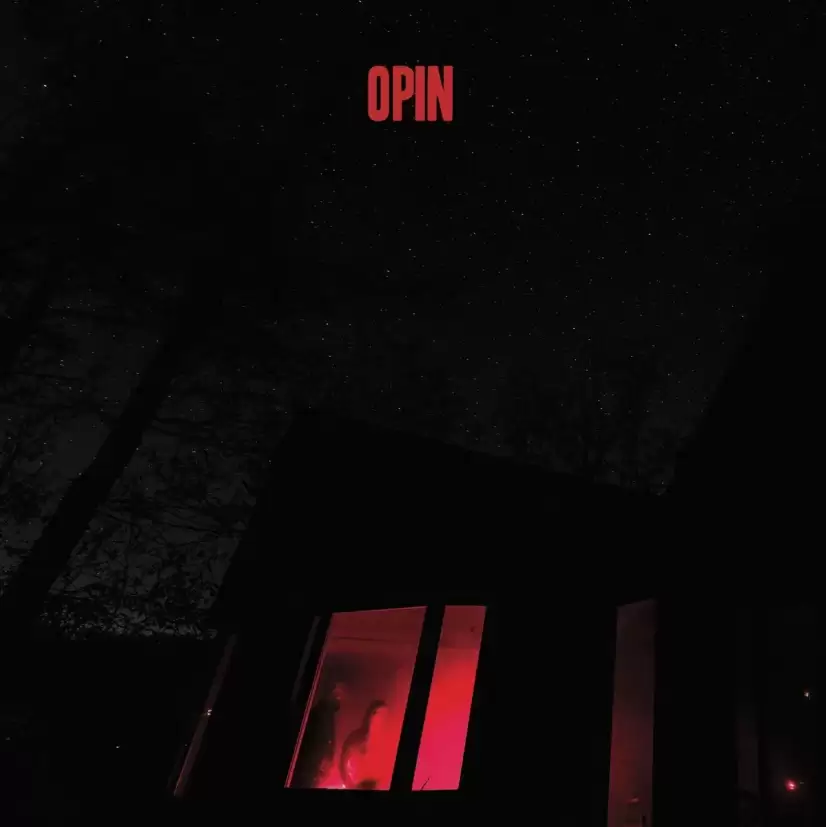
The brainchild of former White Laces members, Landis Wine and Tori Ovater, Opin create experimental pop music using a mixture of synthesizers, electronic drums, horns, and guitars. Their debut self-titled record (Egghunt, 2017) showed the songwriters’ expanding on years of experience by crafting songs that challenge the listener, our understanding of what a “pop song” really is, while still delivering infectious hook-filled tracks.
The artwork pushes against our expectations, too. The haunting photograph (by Samuel Dixon) of Wine and Ovater illuminated by a myserious red glow, paired with the simple matching type (by Julia Brouard) look like they could be an image for the latest indie horror film. Yet, the choice of a sans-serif font with a tall x-height, set tight in all caps, pushes the cover away from being too haunting, towards a more modern feeling. This juxtaposition is what Opin is all about—pushing the boundaries of what is expected, just enough to challenge those engaging with them, without ostracizing or confusing them.
Addy - re call (Kevin Zweernik, 2017)
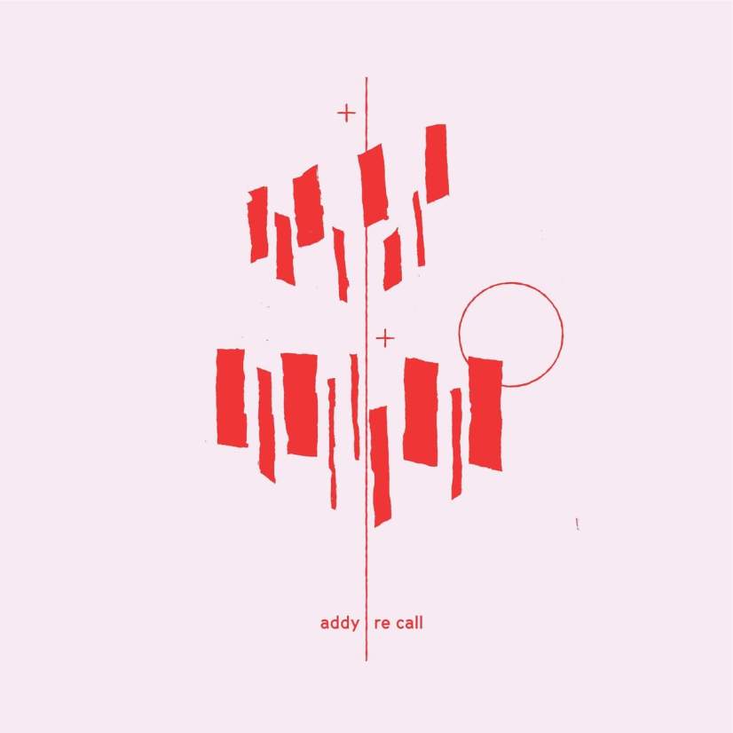
Addy is the moniker under which Richmond’s Adam Watkins, formerly of Wester Green, now performs, as the frontperson of a 4 piece band. In September, 2017, Watkins released his debut EP from the new project, re call. A delicate collection of songs about letting go of the past and learning to love yourself, re call treads a line between folk and experimental electronic music. Watkin’s hushed vocals are transformed by vocal effects, driven along by the warm percussion of a vintage analog drum machine. Kevin Zweerink’s artwork for the EP features a complimentary delicate illustration. The image looks like an avant-garde mobile, rough rectangles hanging weightless around a single thin line that separates the text of the artist and album title.
What are some of your favorite album covers? Let us know in the comments!