
In 2017, I worked for a custom menswear retailer with grand plans for expansion. The company had more than ten brick and mortar locations in major U.S. metros, and our goal was to open five or six more in new markets that year. Before we could sign leases, staff the stores, or launch marketing campaigns, though, we had to pick the right cities to target.
A lot of data goes into choosing a location for any business. We knew a fair bit about our customer base, so we started by identifying cities where busy, suit-clad attorneys and financiers seemed to congregate. That narrowed our options down. At the top of the list was the Live Music Capital of the World, Austin, Texas.
At the time, I reported to an ex-Texan, and he wasn’t exactly enamored with the idea of opening a store in Austin. “It’s a jeans and boots town,” he told me, asking if there was any data I could dig up to prove him right.
So I turned to search volume as a stand-in for demand. How often a cities’ people search for a thing surely represents their interest in it, right?
The problem is that major cities tend to be populous. A lot of people means a lot of searches. Not particularly informative. What we really needed to understand is where demand for a thing (quality custom suits, in this case) was headed. Will more people want suits next year? Can we sustain a location here?
Looking at volume over time isn’t enough, either, because most searches (and most signals related to how people search) look like this:
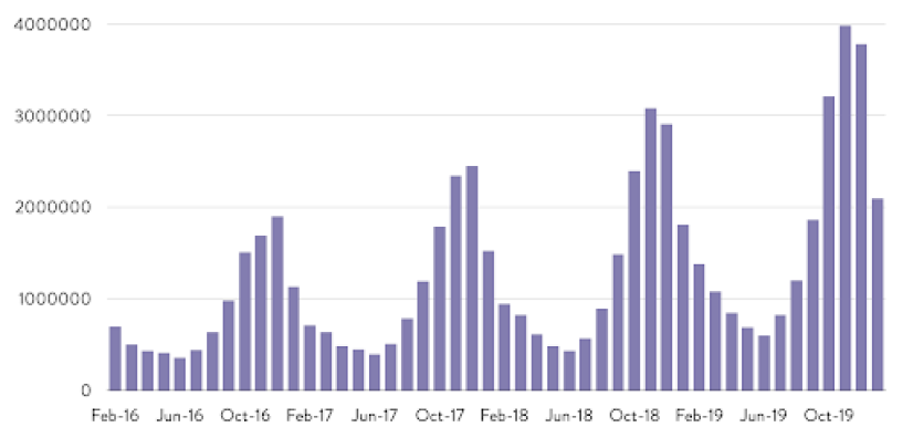
The data hits peaks and valleys in certain months. It exhibits a high degree of seasonality that makes descriptive analysis cloudy at best.
The solution is time series analysis.
Time Series Analysis
All we’re talking about here is explaining data over time. That’s what a time series is—a sequence of evenly-spaced data points over a certain period of time. And every time series is made up of a few components:
St: Seasonality (what happens each month)
Tt: Underlying trend (what truly happens over time)
Ct: Cyclicality (the long-term ebbs and flows)
Et: Error/irregularity (all the extra weird stuff)
Any time series can be decomposed to uncover values for its parts, typically to reveal the trend. In this post, I’ll walk you through a process called seasonal adjustment, which removes the seasonal component from data to create a smooth, easy-to-interpret line you can use to describe what’s happening.
To get the most out of this, you’ll want to be familiar with the basics of R, a programming language for statistical computing. There’s a wealth of free resources out there, like the R Intro from The Comprehensive R Archive Network (CRAN).
Ready to begin? The steps below will guide you through.
1. Preparing the Data
You can conduct time series analysis on any particular signal, e.g. search volume or sessions. I’ll use search volume for this example.
We need data comprehensive enough to give us a good picture of changes over time. It isn’t worthwhile to analyze queries with low search volume (at least not on their own). This will work for high-volume terms; at least a thousand searches per month will do. Additionally, you can look at trends for terms in aggregate, say, to gauge interest in demand for a certain topic instead of a singular keyword.
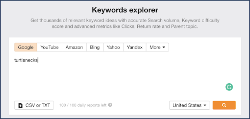
Let’s try looking at turtleneck sweaters. First, we’ll gather a variety of ways people search for turtlenecks. Throwing our head term turtlenecks into a keyword suggestion tool will put us on the right path. My preferred tool is Ahrefs’ Keyword Explorer, but the choice is yours.
The keyword report from Ahrefs gives you some options for keyword ideas lists:
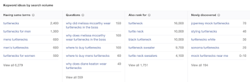
Generally speaking, the “Having same terms” list will give you a strong starting list.
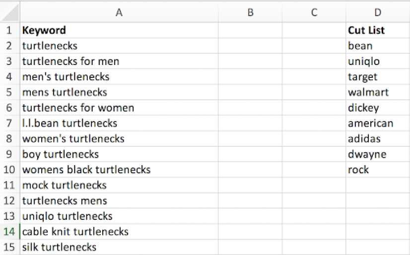
The exported list does, however, contain a number of queries that aren’t relevant to this analysis. The same will be true for many other keyword tools. Here, I want to weed out any branded keywords like L.L. Bean turtlenecks, as well as irrelevant (and inappropriate) searches that might come up, like The Rock turtleneck. We’re going to let Excel do the heavy lifting for us when it comes to sifting through these less-than-useful phrases.
Eyeball your keywords and note the words and phrases that you want to trim out in a separate column, like so:
With your cut list ready, use this formula to tally cells that contain a phrase from your cut list:
=SUMPRODUCT(--ISNUMBER(SEARCH([TERM ARRAY],[KEYWORD CELL])))
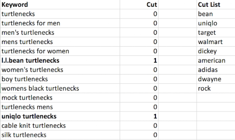
Anything higher than zero contains a word we want to remove. From here, you can sort by your cut column and delete those rows.
If you’re a glutton for meticulous work (or don’t have access to a keyword suggestion tool), you can use keyword permutation instead.
Create separate lists, each containing all of the different modifiers that someone might use to search for your topic. For our turtlenecks example, that might include gendered phrases, colors, materials, and variations of the core term. Try to be exhaustive.
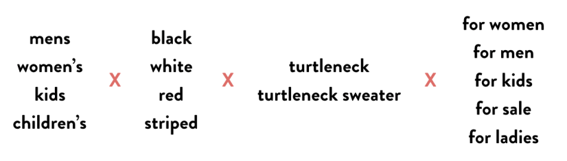
Once you have your lists ready, you can use a keyword multiplier to combine everything. You control the inputs, so there’s no need to do any trimming. Don’t worry about weird phrases that show up, like women’s red turtleneck for ladies—nobody searches like that, so those queries will be removed when we pull search volume.
Speaking of which...
2. Gathering Search Volume
With your target phrases tidied, it’s time to pull search volume data for analysis. We’re going to use Google Ads Keyword Planner because it allows us to pull about four years worth of monthly search metrics.
Navigate to Keyword Planner and choose “Get search volume and forecasts”:

(Here’s KWP’s Help article should you have trouble accessing this screen.)
After you enter your keywords, click into the Historical Metics tab. This screen will display the last twelve months by default, so click into the date picker in the top right:
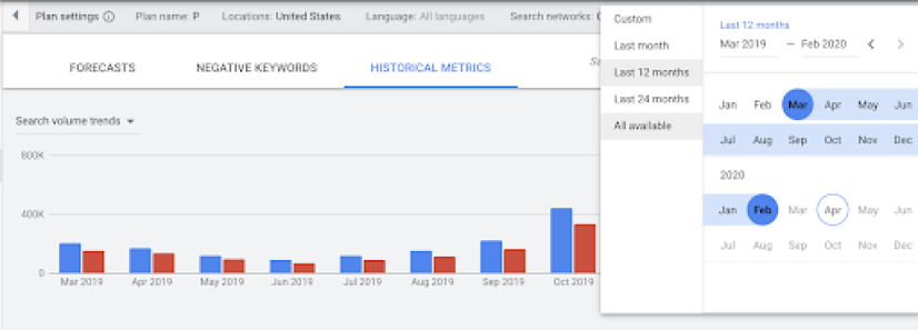
From here, we can select “All available” to pull up to four years of data. The chart should now look something like this:
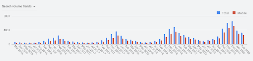
Searches look pretty seasonal, right?
Next, export the Plan historical metrics from Keyword Planner and open up the downloaded CSV.
We now have the number of searches per month for each of our keywords. Because we’re only interested in the trend for the topic (and not any one keyword in particular), we’re going to sum the volume for all keywords each month. Then, we’ll transpose those values into a single column and save that data into a plain text file with an easy-to-remember name. I’m calling mine turtle.txt. That final piece makes it simpler to load into R.
To recap, our steps are:
- Pull all available monthly search volume for your keywords (or sessions or some other metric if you’re not using search volume)
- Add up the total volume for each month
- Save the aggregate monthly searches to a single-column plain text file
Finally, it’s time to get into R.
The Seasonal Package
To analyze and adjust our highly seasonal turtleneck data, we’ll make use of an R package called seasonal. This package serves as an interface between R and X-13ARIMA-SEATS, which is seasonal adjustment software developed by the U.S. Census Bureau. X-13ARIMA-SEATS offers powerful, flexible capabilities to professional statisticians. For amateurs like me, though, it can generate reasonably good data without much fuss.
We’ll also use the seasonalview package, which creates a GUI within R for the seasonal package.
To install and load these packages, run the following lines in your R console:
> install.packages(seasonal)
> install.packages(seasonalview)
> library(seasonal)
> library(seasonalview)
From here, I’ll go line-by-line explaining what each piece of code accomplishes.
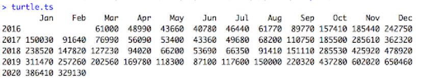
> turtle <- read.table("~/Documents/turtle.txt", quote="\"", comment.char="")First, we import our data from turtle.txt using the read.table function and assign that data to a new variable called turtle.
Note that I saved my turtle.txt file to my Documents folder. If you save yours elsewhere, you’ll need to type in the right file path.
If you’re using R Studio, you can instead use the Import Dataset menu to make this happen. Our first line of code here replicates that effect.
There are lots of ways to import data into your R environment—we’re doing it this way because it’s straightforward even if you’re unfamiliar with R.
>turtle.ts <- ts(turtle, start=c(2016,3), end=c(2020,2), frequency=12)
Next, we create a time series using the data from turtle and assign it to a new variable turtle.ts.
The ts function coerces our single column of search volume data into a time series. You’ll need to use the date range you pulled for the start and end dates. Our example data starts in March 2016 (2016,3) and ends in February 2020 (2020,2). The final piece of this function’s argument specifies that we’re using a 12-month year.
Enter your variable name into your R console to see the result. It should look something like this:
turtle.seas <- seas(turtle.ts)
Here, we run the seas function with default settings on our time series object turtle.ts and assign it to the new variable turtle.seas. It’s a simple line of code with a lot going on behind the scenes. In short, it performs seasonal adjustment on our data, logging all of the steps and outputs into a new variable.
Now we can pause and check out outputs.
> view(turtle.seas)
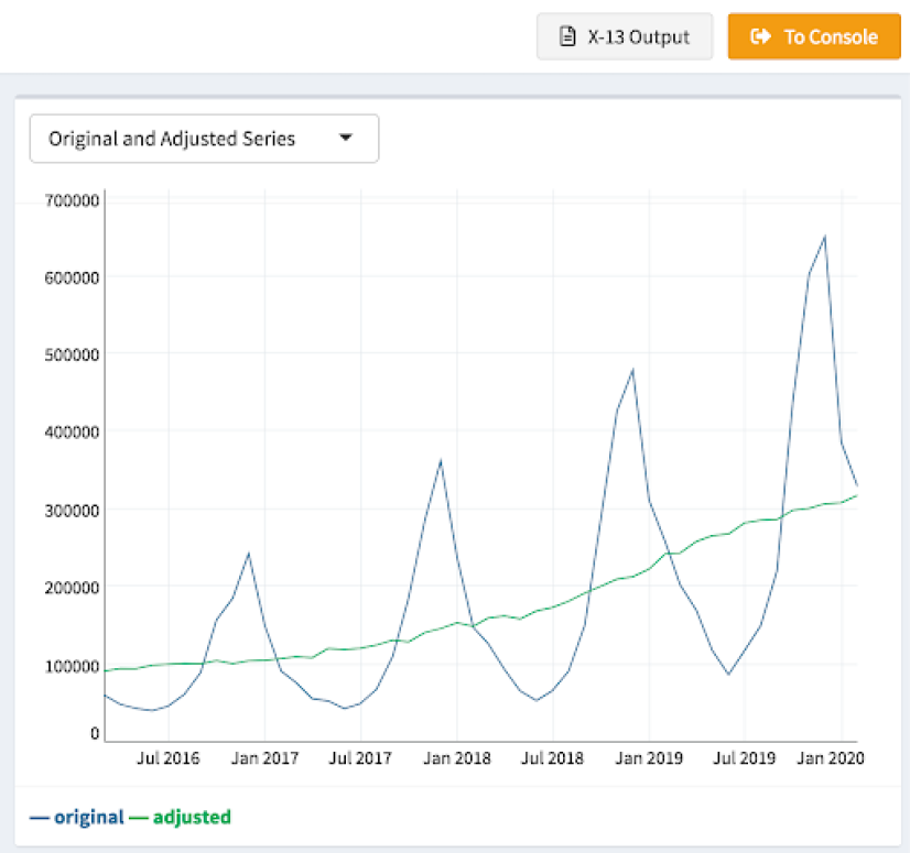
Using the view function from seasonalview on our new variable opens up a graphing interface that includes a chart like the one above. It’s already much clearer how demand for (or at least interest in) turtlenecks has changed over the past few years. The seasonal component has been removed, leaving a nice, smooth-ish line representing the underlying trend in search volume.
Oh, and that gray “X-13 Output” button above the chart? Clicking that will open a page in your browser that displays the full output for the seasonal adjustment, including the values for each component in your time series, the adjusted series, and forecasts for your data that you can use to predict the future.
But let’s say you want to share the final adjusted series with your clients, coworkers, or families, and you don’t like screenshots of blue and green graphs. We can solve for that.
>turtle.seas.frame <- as.data.frame(turtle.seas)
This line coerces the turtle.seas object into a data frame and assigns it to the new variable turtle.seas.frame. (If you’re unfamiliar with R, a data frame is basically a fancy table.) Doing this makes it easier to extract the data we care about.
> turtle.final <- c(turtle.seas.frame[2])
Next, we run a line that creates a vector from the second column in our turtle.seas.frame table, which contains the adjusted time series, and assigns it to a new variable, turtle.final.
>write.csv(turtle.final,"Documents/turtlefinal.csv")
Finally, we write the final adjusted series to a new file called turtlefinal.csv. With that, you get the numerical values you can use in the graphing tool of your choice.
It’s worth noting that R has powerful graphing capabilities with packages like ggplot2. We won’t get into that here, however.
Okay, so, how do I use this?
I’ve found the simplest way to use this in my day-to-day work is to help describe what’s happening to a given metric over time as a component of broader analysis. The degree to which a signal is moving up or down is one piece of the puzzle—this won’t tell you what to do or how to do it by itself.
It did help answer some questions about whether or not Austinites wear suits, though. I ran Austin’s localized search volume through this process and found that, yes, demand for our product was trending upward in that city.
If you stop there, though, you might miss the bigger picture.
I also ran 30 other cities’ searches through the process, including those where we already had stores, for comparison. The closest comparison was Charlotte, NC. Charlotte and Austin are both southern cities with extremely similar population sizes, among other measurables we were reviewing. Charlotte’s searches were growing roughly five times faster than Austin’s, and we were having a hard time gaining a foothold in that market. If Austin’s interest in our offerings was growing more slowly than a city’s where business was tough, why should we open up shop in A-town?
So, we didn’t pick Austin. I’d love to say I was the hero here—that the decision was made based on my fastidious analysis. But ultimately we went a different route. Thus is business, and thus is the life of an analyst at a startup. Despite the fact that economic and operational factors sometimes override other influences, data analysis does play an important role in affecting business decisions.
At a more granular level, you can use this method of statistical analysis to:
- Inform evergreen content planning by comparing growth across searches for different topics
- Forecast paid search budgets by isolating seasonal trends among keyword targets
- Explain what’s happening in branded search to build a case for (or against) awareness ads
Thoughts? Questions? Send them our way.